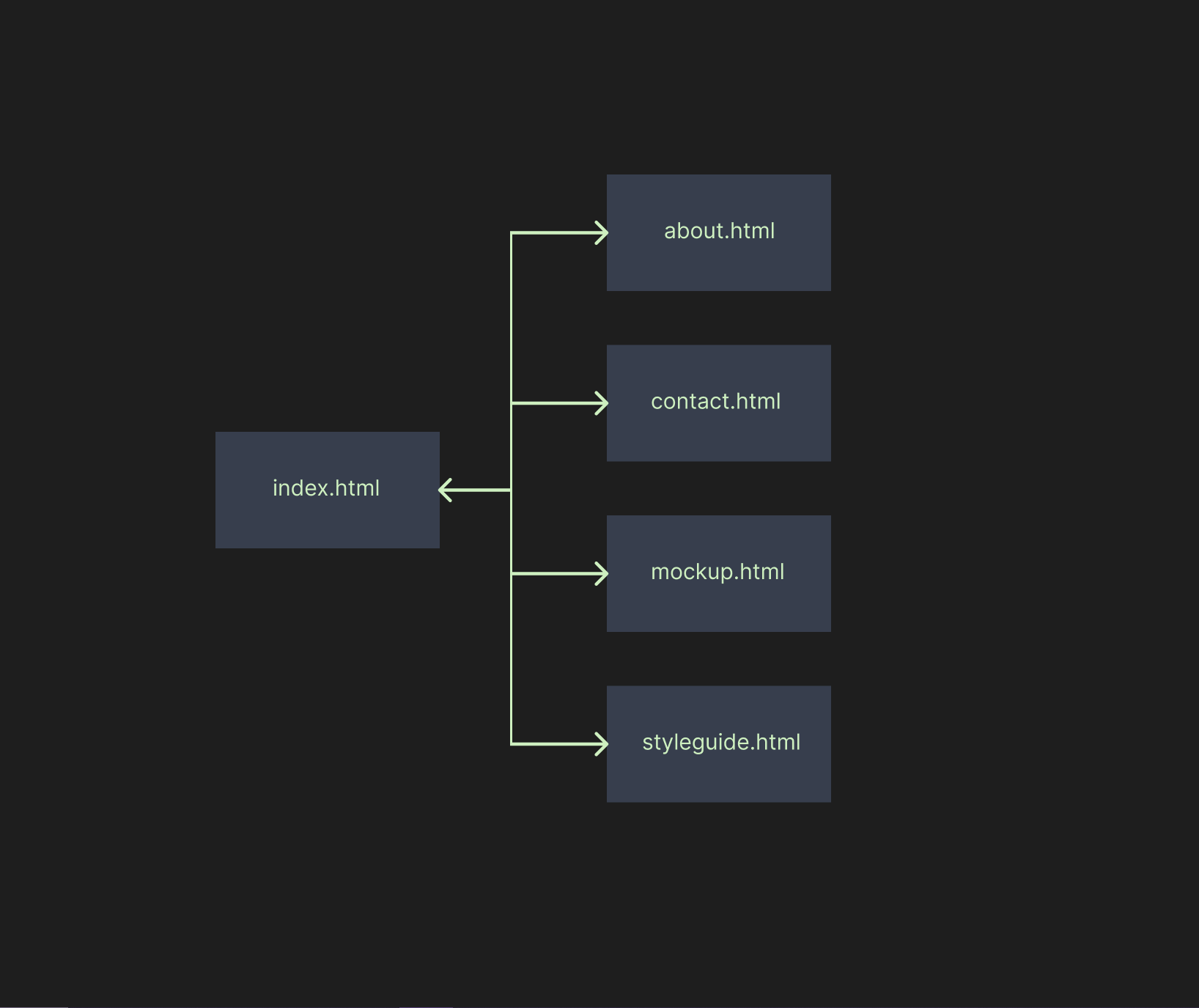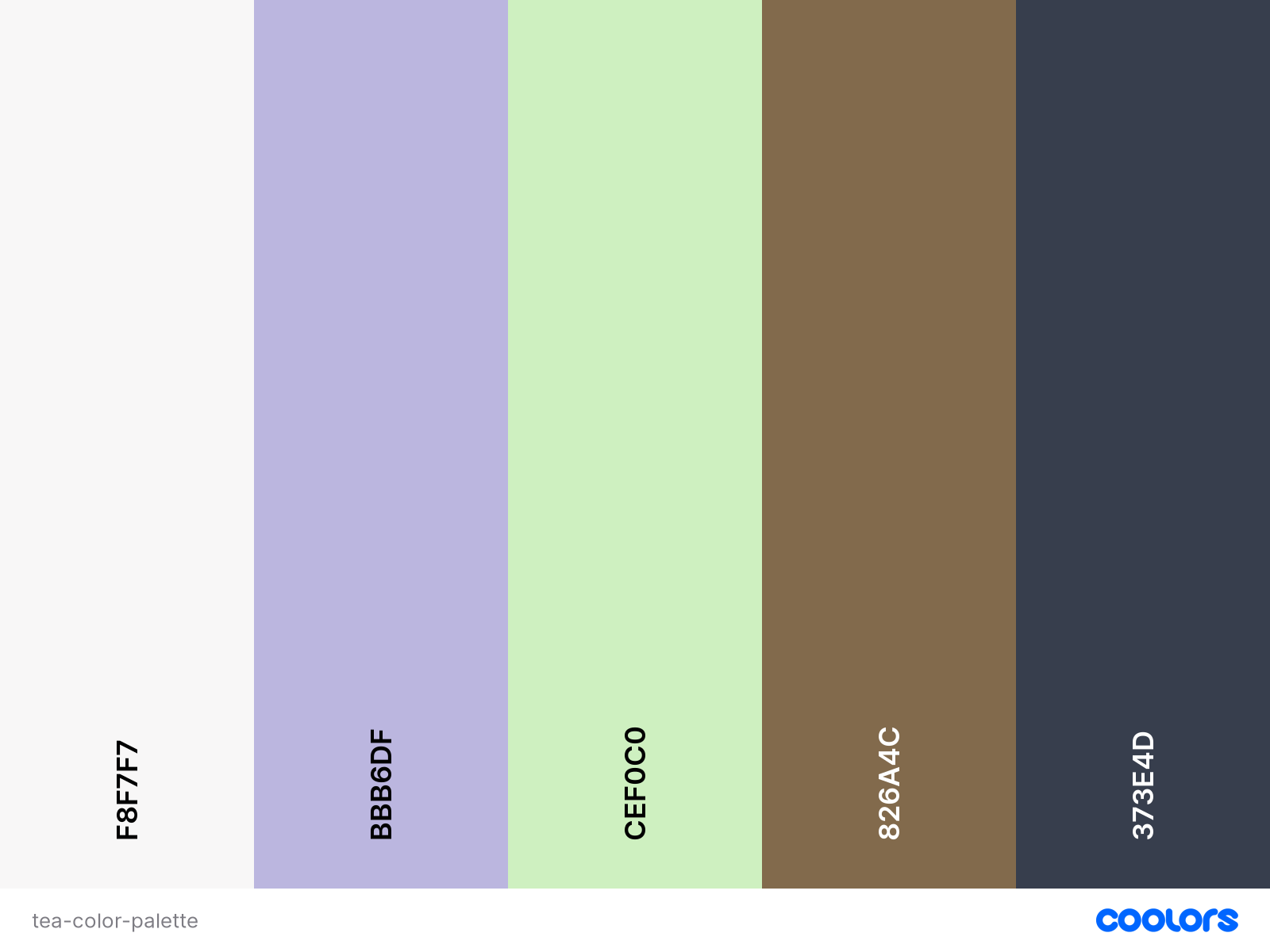
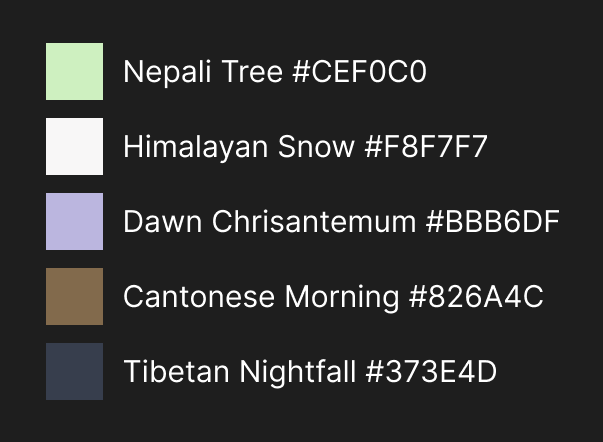
Earthly, soily colors.
Main brand color: #CEF0C0 (Nepali Tree)
This is the main color of our brand. Representing the light green tea leaves, it brings the youthful and fresh
taste of the most greenish teas to our web.
Light shades: #F8F7F7 (Himalayan Snow)
You always should have some kind of white shade in the color palette of your site, and so,
this is ours. Not so much bright, but with a little hue of beige.
Light accent: #BBB6DF (Dawn Chrisantemum)
This color should be used in the buttons of the site, as well as in all the links.
Dark accent: #826A4C (Cantonese Morning)
This clear earth color is used for the header of the site and also to pitch a little bit the
different sections of the webpage, as different divs and sections.
Dark shades: #373E4D (Tibetan Nightfall)
This color is mainly used as a background color for our site, as is a tranquil and watery shade of gray that
brings some contrast to our page, helping the in the highlight of other elements. You sould always use it in the background.
system-ui, -apple-system, BlinkMacSystemFont, 'Segoe UI', Roboto, Oxygen, Ubuntu, Cantarell, 'Open Sans', 'Helvetica Neue', sans-serif
This is the selected font for the site, and all of its pages, and all possible related marketing about the site must be created using this font. Its clear and simple design were the main reasons for selecting it.
Wild cherry blossoms, glowing in the morning sun!
This is a quote from Motoori Morinaga, a japanese poet and historian. As our color palette and general ambience could be more similar to those morning cherry blossoms it all started with the vision of a verdant tea field in a mountain, but we wanted to add some accent colors, strong colors. So this vivid image from Morinaga inspired us to deliver something more interesting and hopefully beautiful.
We have taken into account the neccesities of all the people that we could while designing our webpage, and because of that our site is easy to navigate and userfriendly.
When it comes to colors and hues of colors, we follow the guidelines of accesibility, and so we tried to always put light fonts in dark backgrounds and viceversa. The size of the fonts is enough for each of the spaces where they appear, always trying not to use very small font size. Also, the font chosen is very clear and simple, so it is easy to read.
Color-blind options should be implemented pretty soon.
More accesibility test should perform as guarantee for the correct use of shapes, colors and fonts in our site. We are always open to questions and recomendatiosn from our clients.
Our logo tried to be simple, so it is what it is, like our products.
It should always have the same size in each side, so it is like if it were inside a square.
The exact size of the logo in the header is 60x60.
Forms should always be inside a brown div, like the header.
Buttons should always be in our light violet shade.
Our brand strives to send all kinds of tea to all the people possible in the world!